The Full Interview: Criss Rosu
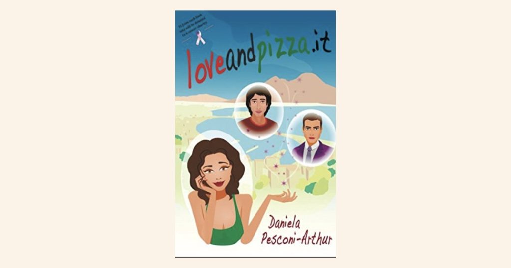
This bonus post is the complete, unedited conversation with Criss Rosu, the illustrator and designer behind the Loveandpizza.it cover. It accompanies Day 30 of the Loveandpizza.it series, for anyone who wants every question, every answer and all the behind-the-scenes details. 🎨🍕 This interview was conducted in 2026 and is published here in full, exactly as our conversation unfolded.
1. How would you describe what you create, and what do you love most about being an illustrator and designer?
I usually say that I help bring people’s ideas and dreams to life through illustration and design.
Most people know me for my book covers and children’s book illustrations, but I also create branding, websites and custom illustrations for creative businesses. Even though those projects are different, they all have one thing in common. They’re all about telling a story.
What I love most is that every project starts with an idea. Sometimes it’s just a few notes from an author or a business owner, and together we slowly turn that idea into something people can actually see and connect with.
With books, I think it’s even more special. Writers spend months, sometimes years, creating an entire world with words. Then I get to create the very first visual impression of that world. Before readers fall in love with the story, they fall in love with the cover. That’s a big responsibility, but it’s also what I love the most.
There’s a quote that says, “A picture is worth a thousand words,” and I really believe that. I love creating illustrations that make someone stop, look twice and become curious enough to pick up the book. For me, that’s when a cover has done its job.
2. When did you realize visual storytelling was something you wanted to pursue professionally?
I’ve loved drawing for as long as I can remember.
One of my favourite childhood memories is sitting in art class with my teacher. She taught me how to draw faces and the human body, and I remember thinking it was fascinating. I was always the child who loved drawing, colouring and making things.
When I was younger, I actually dreamed of becoming a fashion designer. I loved fashion illustrations, beautiful dresses and elegant details. Life took me in a different direction, but looking back, I think I still became a designer, just in a different way.
Before I started illustrating professionally, I spent more than ten years working in the wedding industry. I designed wedding invitations, stationery, flowers and decorations. It was such a creative environment, and without even realizing it at the time, I was learning about colour, composition, typography and how small details can completely change the feeling of a design.
About six years ago, I decided to focus much more seriously on digital illustration. The more I created, the more I realised that storytelling through illustration was what I truly enjoyed.
It never really felt like changing careers. It felt more like everything I had done before had been preparing me for this.
3. Where do you usually begin when you’re creating a book cover?
Everything always starts with the story.
I usually read the brief several times because I’m not only looking for visual details. I’m trying to understand the feeling behind the story. Is it romantic? Is it funny? Is it emotional? I want to understand what readers should feel before I even start thinking about colours or composition.
Whenever possible, I also like reading an excerpt from the book. It helps me understand the author’s writing style and the personality of the characters. I think that’s incredibly valuable because every author has a different voice.
Once I feel like I understand the story, I start thinking about the composition, the setting and the characters.
I sketch everything on my iPad. I love working digitally because I can experiment very quickly with different ideas, colours and compositions before deciding which direction feels right.
I never want a cover to be beautiful just for the sake of being beautiful. I want it to tell the reader something about the story before they even open the book.
4. How has your background in branding, web design and photography influenced your illustration work?
I actually think it influences my work every single day.
Because I also work in branding, web design and photography, I naturally think about much more than just the illustration itself.
I always say that a book cover is the brand of a book.
When someone sees a cover for the first time, that’s their first impression. Before they know the characters or the story, they already have a feeling about the book.
So while I’m illustrating, I’m also thinking about typography, readability, colour psychology, composition and how everything works together.
I’m thinking about how the cover will look on a bookstore shelf, but also how it will look as a tiny thumbnail on Amazon or Goodreads.
I think having experience in different creative fields helps me see the bigger picture. The illustration is incredibly important, but typography and layout are just as important because together they tell one complete story.
5. What was your first impression when Daniela shared the brief for Loveandpizza.it?
Honestly, I think it was Italy.
I absolutely love Italy, so the moment I started reading Daniela’s brief, I immediately connected with it.
My husband and I actually spent our honeymoon in Italy, so reading about Napoli instantly brought back memories of beautiful little streets, amazing food, sunshine, flowers and that relaxed atmosphere that Italy has.
I could already picture Carolina walking through colourful streets with pizza shops, boats, flowers and all those little details that make Naples feel so alive.
I think having that personal connection made the project even more special for me because I wasn’t imagining a place I’d never seen. I was remembering how it felt to actually be there.
From the beginning, I knew I wanted the cover to feel warm, whimsical and romantic.
I wanted readers to look at it and feel like they were already stepping into Italy before opening the first page.
6. Before you started sketching, what was the most important thing you needed to understand?
Definitely Daniela’s vision. Every author has a slightly different way of imagining their story, and I think that’s one of the most important parts of my job.
I don’t want to replace the author’s imagination. I want to understand it first.
That’s why I always ask questions. Sometimes they’re about the characters, sometimes they’re about the atmosphere or even small details that might not seem important at first.
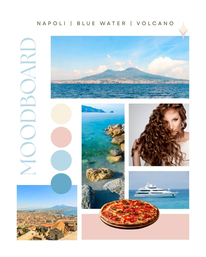
I love when authors send Pinterest boards, inspiration photos or little notes because they help me understand how they’re seeing the story in their mind.
Then my job is to translate those ideas into an illustration while also bringing my own creativity and experience into the project.
For me, the best covers always happen when it feels like a real collaboration. The author brings the story. I bring the visuals. And together we create something that hopefully feels even stronger than either of us imagined on our own.
7. What emotions did you hope readers would feel the very first time they saw the cover?
The first feeling I wanted was curiosity.
I wanted someone to see the cover and immediately wonder, “What’s this story about?” That’s always my goal with a book cover.
Of course I wanted it to feel beautiful, but beauty alone isn’t enough. A cover should make people feel something.
With Loveandpizza.it, I wanted readers to feel warmth, joy and a little bit of romance. I wanted them to imagine sunshine, colourful streets, flowers, great food and that feeling of escaping somewhere beautiful.
I also wanted the cover to feel light and uplifting. Sometimes a single illustration can give you an idea of the atmosphere before you’ve read a single sentence, and I hoped this cover would do exactly that.
If someone looks at it and instantly wants to spend an afternoon in Napoli with Carolina, then I know I’ve done my job.
8. Napoli almost feels like another character in the story. How did you balance the city with Carolina without letting one overpower the other?
I actually loved that challenge because I think locations can tell stories just as much as people do.
Napoli is incredibly vibrant. It’s full of colour, history, little cafés, flowers, architecture and beautiful details. It has so much personality that it could easily become the main focus.
But at the end of the day, Carolina is the heart of the story.
So while I wanted readers to immediately recognize the Italian atmosphere, I also wanted their eyes to naturally go to her first.
That’s why I tried to use the city as a beautiful backdrop instead of the main subject. Napoli supports the story. It surrounds Carolina and helps create the mood, but she remains the person readers connect with first.
I think that’s what good illustration should do. Every element should have a purpose, but nothing should compete for attention. Everything should work together to tell one story.
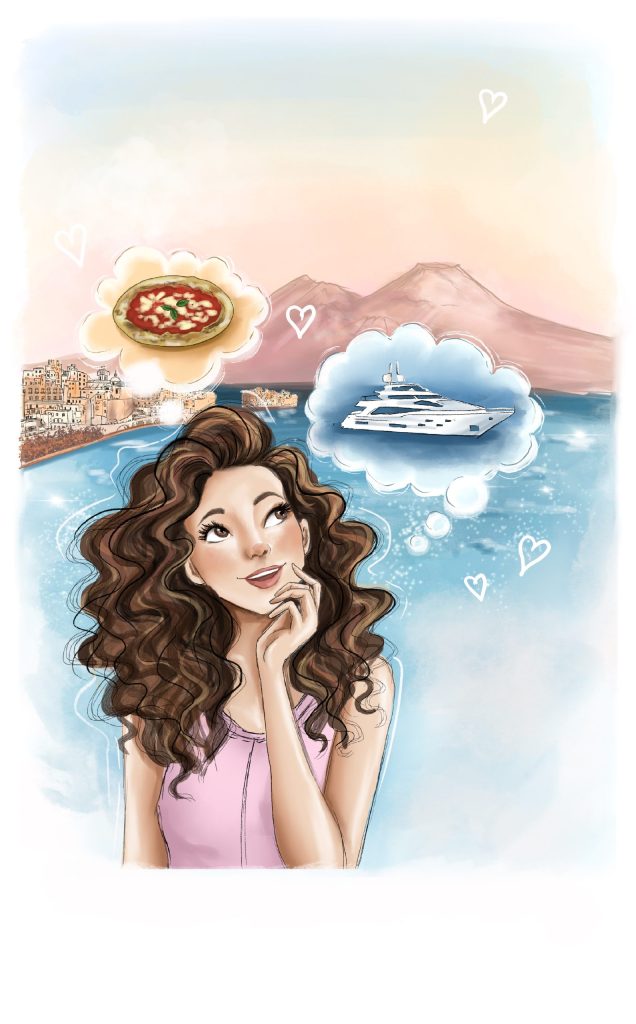
9. Daniela shared several reference photos during the project. How important are those references for your creative process?
I actually love receiving reference photos.
Some people think reference images limit creativity, but for me it’s exactly the opposite. They help me understand what inspired the author in the first place.
Maybe it’s the feeling of a street, the architecture, the colours, the flowers or even just the atmosphere. Those little details help me understand the world the author has been imagining while writing.
Reference photos simply become part of the research process. They’re another way of understanding the story before I start creating something new. The more I understand the author’s vision, the easier it is to create a cover that truly feels like their book.
10. Could you walk us through your creative process from the first brief to the final cover?
Of course.
Everything starts with the brief. I read it several times because I’m trying to understand much more than just what should appear on the cover. I’m looking for the atmosphere, the emotions and the personality of the story.
If I have excerpts from the manuscript, I read those too. They help me understand the author’s writing style and the characters much better. Once I feel like I understand the story, I begin gathering ideas and thinking about composition.
Then I start sketching on my iPad. Usually I create rough sketches first because it’s much easier to explore different ideas before spending hours on the final illustration.
After choosing the strongest concept, I continue developing the illustration by adding colours, lighting and all the little details that help bring the story to life.
At the same time, I also think about typography because I don’t see the illustration and the title as two separate things. They’re part of one design.
Throughout the process I stay in contact with the author. We discuss ideas, make revisions if needed and refine everything together. Only once everything feels balanced do I prepare the final files for print and digital platforms.
It’s a process with many small steps, but I enjoy every single one because it’s amazing to watch an idea slowly become something real.
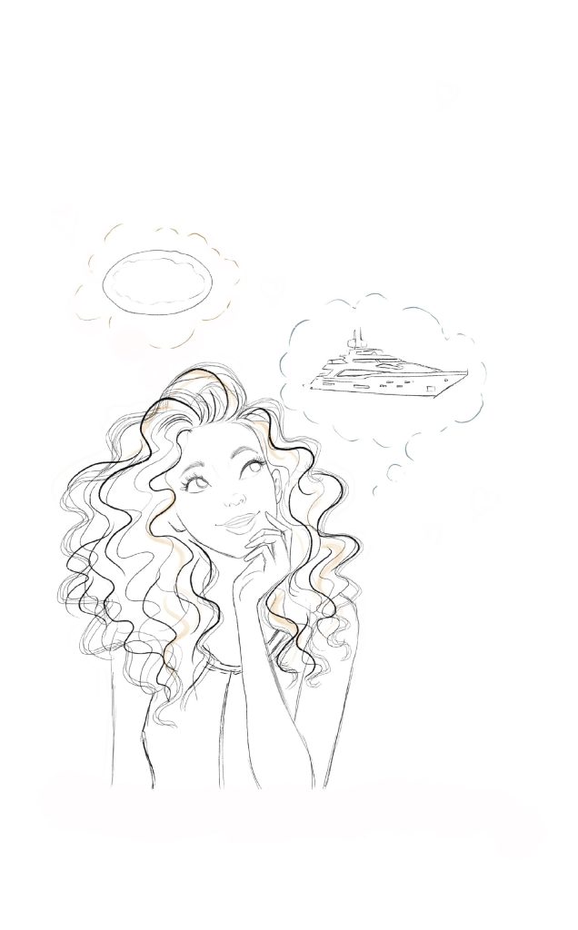
11. Was there anything about this project that surprised you or challenged you in a new way?
I think what made this project different was that I wasn’t only illustrating the cover.
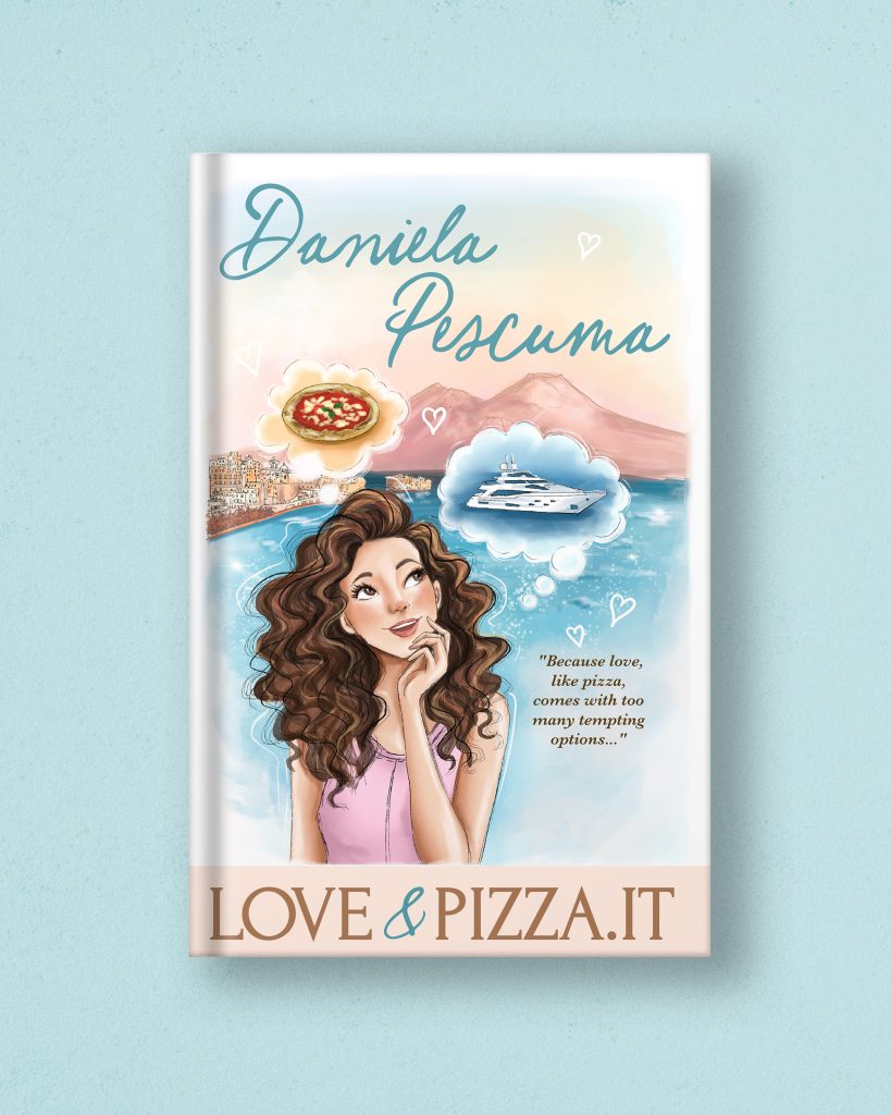
I also had the opportunity to design the complete cover, including the typography and the overall layout.
I enjoyed thinking about how the typography could become part of the illustration instead of simply sitting on top of it.
12. Turning feelings into visual elements seems almost magical. How do you actually do it?
I think it starts with listening. Before I think about colours, composition or typography, I spend time trying to understand how the author feels about their story. Sometimes that happens through conversations, sometimes through mood boards or Pinterest references, and sometimes simply by reading the way they describe their characters and the world they’ve created.
Once I understand the emotional side of the story, I begin translating those feelings into visual choices. Warm colours can create comfort, soft lighting can make a scene feel romantic, and certain architectural details or flowers can instantly transport readers to a specific place. Every decision, even the smallest one, helps shape the overall atmosphere.
Typography is part of that process as well. A font has its own personality, just like an illustration does, and together they create the first impression of the book.
At the end of the day, illustration isn’t just about drawing something beautiful. It’s about making people feel something. If readers can look at a cover and already imagine the atmosphere of the story before they’ve even opened the book, then I know I’ve achieved exactly what I set out to do.
13. What, in your opinion, makes the difference between a beautiful book cover and a truly successful one?
I think a beautiful cover catches your attention, but a successful cover makes you want to open the book. There’s a big difference between those two things.
Of course, the illustration has to be visually appealing, but that’s only one part of the equation. A successful cover gives readers a feeling before they even know the plot. It creates curiosity, sets expectations and offers a small glimpse into the world they’re about to enter. Even if someone can’t explain exactly why they’re drawn to a particular cover, they instinctively know that it speaks to them.
My background in branding has definitely influenced the way I think about book covers. I often say that a book cover is the brand of a book. It’s the very first interaction readers have with the story, and in just a few seconds it needs to communicate personality, genre and emotion.
That’s why I pay so much attention not only to the illustration, but also to typography, colour palette, composition and balance. When all those elements work together, the cover doesn’t just look beautiful. It tells a story before the first page has even been turned.
14. Typography plays such an important role in your work. How do you decide what style fits a particular story?
Typography is honestly one of my favourite parts of the design process. I think people often underestimate how much emotion a font can communicate.
Before choosing anything, I spend time thinking about the personality of the story. Is it elegant? Light-hearted? Romantic? Contemporary? Every typeface has its own voice, just like every illustration does, so I want them to complement each other instead of competing for attention.
With Loveandpizza.it, I wanted the typography to feel warm, feminine and inviting. I remember trying several different options before finding the one that felt just right. When I came across the lettering for Postcards from Napoli, I immediately knew it belonged on the cover. It had character, movement and a handcrafted feeling that matched the atmosphere I was trying to create.
For me, typography should never feel like something that’s simply placed on top of an illustration. It should feel like it has always been part of the artwork, helping tell the story in a subtle but meaningful way.
15. Your illustrations have a very recognizable style. How would you describe it, and where do you find your inspiration?
That’s always a difficult question because I don’t think I consciously decided to have a particular style. It developed naturally over the years through the projects I worked on and the things I personally love.
People often describe my work as feminine, whimsical, romantic and elegant, and I think those words fit quite well. I’m naturally drawn to soft colour palettes, flowers, charming architecture and beautiful little details that create a sense of warmth and nostalgia.
I’m also constantly inspired by places I love. Paris has always been my favourite city, but I also love London, New York and, of course, Italy. I enjoy wandering through beautiful streets, visiting cafés, looking at shop windows and noticing the little details that make each place unique. I think those experiences quietly find their way into my illustrations, even when I’m not intentionally referencing them.
At the same time, I never want my style to become repetitive. Every story deserves its own personality, so I always try to adapt while still keeping the essence of what makes my work recognizable.
16. Your covers may appear in different formats and even different languages. Does that affect the way you design them?
Absolutely. It’s something I think about from the very beginning of every project.
Today, a book cover has to work in so many different places. It might be printed as a paperback, a hardcover or a special edition. It also needs to look great as a tiny thumbnail on Amazon, Goodreads or social media, where readers often discover books for the first time.
Different languages can also change the design quite a bit. Some titles become much longer after translation, while others are shorter, so the typography and layout need enough flexibility to adapt without losing the overall balance of the cover.
My goal is always to create a design that feels consistent no matter where readers see it. Whether someone is holding the book in a bookstore or scrolling past it online, I want it to have the same visual impact and communicate the same emotions.
17. What do you enjoy most about collaborating with authors?
Without a doubt, it’s getting to know how they see their own stories.
Every author has a completely different creative process. Some arrive with detailed descriptions of every character and every scene, while others simply describe the feeling they want readers to experience. I genuinely enjoy both approaches because every conversation teaches me something new.
Writing a book is such a personal journey, and I know how emotionally attached authors are to their stories. Because of that, I always try to listen carefully before I start offering ideas. I ask questions, discuss possibilities and make sure I truly understand what they’re imagining.
I don’t see my role as replacing the author’s vision. My job is to translate it into something readers can see and feel. That’s probably my favourite part of the entire process.
I think the strongest book covers are created through collaboration. When both people trust each other and work toward the same goal, the final result is always better than what either of us could have created alone.
18. Looking back at Loveandpizza.it, what will you remember most about this project?
I think I’ll remember how happy it made me every time I opened the file.
Working on this cover constantly reminded me of Italy, and because my husband and I spent our honeymoon there, it brought back so many wonderful memories. It almost felt like taking a little trip every time I sat down to illustrate.
I’ll also remember Daniela’s enthusiasm throughout the project. She cared deeply about her story and had a very clear vision, but she also trusted me to interpret it in my own style. As an illustrator, that kind of trust is incredibly meaningful because it creates room for creativity while still feeling like a true collaboration.
When I finally looked at the finished cover, I had one simple thought: I would absolutely pick up this book if I saw it in a bookstore.
For me, that’s probably the best compliment I can give my own work. If I’m excited to stop, look at it and want to know what’s inside, then hopefully readers will feel exactly the same.
19. What advice would you give to indie authors who are looking for the right illustrator or cover designer?
I think the first piece of advice would be to take your time.
Your book cover is one of the most important investments you’ll make because it’s often the first thing readers see. A great cover won’t guarantee success, but it can absolutely encourage someone to pick up your book or click on it online.
A good collaboration is just as important as good design. I also recommend looking through their portfolio to see if they create work that feels consistent and thoughtful.
Finally, trust the process. If you’ve chosen someone because you love their work, give them the space to bring their creativity into the project. The best ideas often come from collaboration rather than trying to control every little detail.
20. If you could illustrate any type of book or collaborate with any author in the future, what would your dream project be?
That’s such a difficult question because there are so many stories I’d love to illustrate.
I’ve always been drawn to romantic stories with beautiful settings, especially ones that take place in cities like Paris, London or New York. I love stories with strong female characters, charming cafés, flowers, fashion and architecture because those are all things that naturally inspire me.
More than working with a specific author, I think my dream is simply to keep collaborating with people who are passionate about their stories. Those are always the projects that become the most rewarding.
21. If an author is reading this interview and would like to work with you, what should they know before reaching out?
The first thing I’d say is don’t worry about having everything figured out before you contact me.
Many authors think they need to know exactly what they want before reaching out, but that’s not true at all. Some clients come with detailed briefs, while others simply tell me about their story and ask for guidance. Both are completely fine.
I actually enjoy helping people organize their ideas and figure out the best direction for their project. The design process is something we build together, so you don’t have to have all the answers from the beginning.
The most important thing is simply to tell me about your story. From there, we can talk about your vision, your readers and the atmosphere you want to create.
Every collaboration starts with a conversation, and I think that’s the best place for any creative project to begin.
22. Is there a particular detail on the Loveandpizza.it cover that you’re especially proud of?
I think it’s how everything came together as one complete piece.
Sometimes when I work with editors I’m asked to create the illustration, but for this project I also had the opportunity to design the typography and the overall cover layout. That made the project especially rewarding because I could think about every visual element from start to finish.
I also love Carolina’s expression. I wanted her to feel warm, approachable and curious, almost as if she’s inviting readers to come with her on this journey.
The soft pastel colours, the Italian scenery and the typography all work together to create the atmosphere I had imagined from the very beginning.
When I look at the finished cover, I don’t notice individual elements anymore. I simply see the story, and I think that’s probably the best outcome a designer could hope for.
23. What do you hope readers will remember after seeing your work on this cover?
More than anything, I hope they remember how it made them feel.
Illustration is emotional. Long after people forget the small details, they usually remember the feeling something gave them.
If this cover makes someone smile, dream about visiting Italy or feel excited to start reading, then I’ve done exactly what I hoped to do.
And once they’ve finished the book, I hope the cover becomes connected to those memories. I love when readers say they can’t imagine a story without its cover anymore. That means the visual and the words have become part of the same experience.
For me, that’s the most rewarding part of creating book covers.
24. Where can readers and authors find more of your work?
Readers and authors can discover more of my work on my website, www.crissrosu.com, where I share my portfolio and information about my illustration and design services.
I’m also very active on Instagram, @criss_rosu, where I post behind-the-scenes moments, works in progress, finished book covers and other creative projects. I love sharing a little bit of the process because I think it’s interesting to see how an idea slowly turns into a finished illustration.
If anyone is thinking about creating a book cover or simply wants to say hello, I’d be delighted to hear from them.
Criss’s Creative Slice (Quick Fire Round)
Traditional or digital?
Definitely digital. I draw almost everything on my iPad, and I love how flexible the process is. It allows me to experiment freely while still keeping the hand-drawn feel that I enjoy.
What’s your favourite thing to illustrate?
Characters, without a doubt. I love bringing personalities to life and making readers feel connected to someone before they’ve even started reading.
Serif or script fonts?
Probably script. I love elegant lettering with a handcrafted feel, although the story always decides what’s right.
Favourite city for inspiration?
Paris. It has inspired me for years, and I never get tired of its cafés, architecture, flower shops and little streets.
Describe your dream workspace.
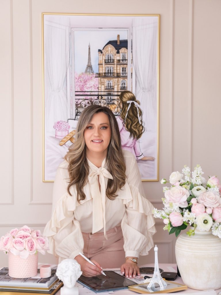
Lots of natural light, fresh flowers, a cozy desk, good coffee and little treasures I’ve collected while travelling, especially from Paris, London and New York. I love surrounding myself with beautiful things because they inspire me every day.
What’s the hardest part of illustrating a book cover?
Understanding the feeling behind the story. Drawing is only one part of the job. Capturing the emotion is much harder, but it’s also what makes the work meaningful.
What’s the most satisfying moment in the whole process?
Holding the printed book for the first time. Seeing something that started as a simple sketch become a real book never gets old.
Describe Loveandpizza.it in three words.
Whimsical. Joyful. Dreamy.
Pineapple on pizza?
Yes… and I know that’s a controversial answer! Hawaiian pizza is actually one of my favourites.
Find more of Criss’s work at www.crissrosu.com or on Instagram at @criss_rosu.
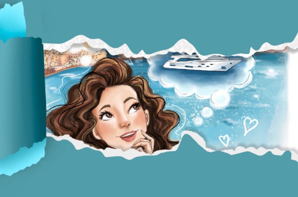
P.S. And here’s Criss’s own reveal of the cover, set to music…😍
Still hungry for another slice?
Follow @loveandpizza_it for story crumbs, Napoli discoveries and
beautifully complicated hearts. ❤️🍕